Guide 04
20,00 €
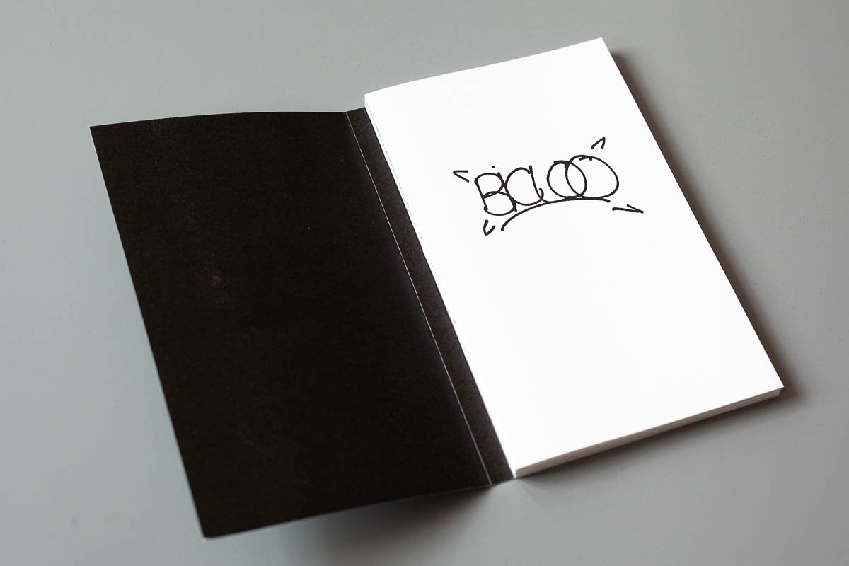
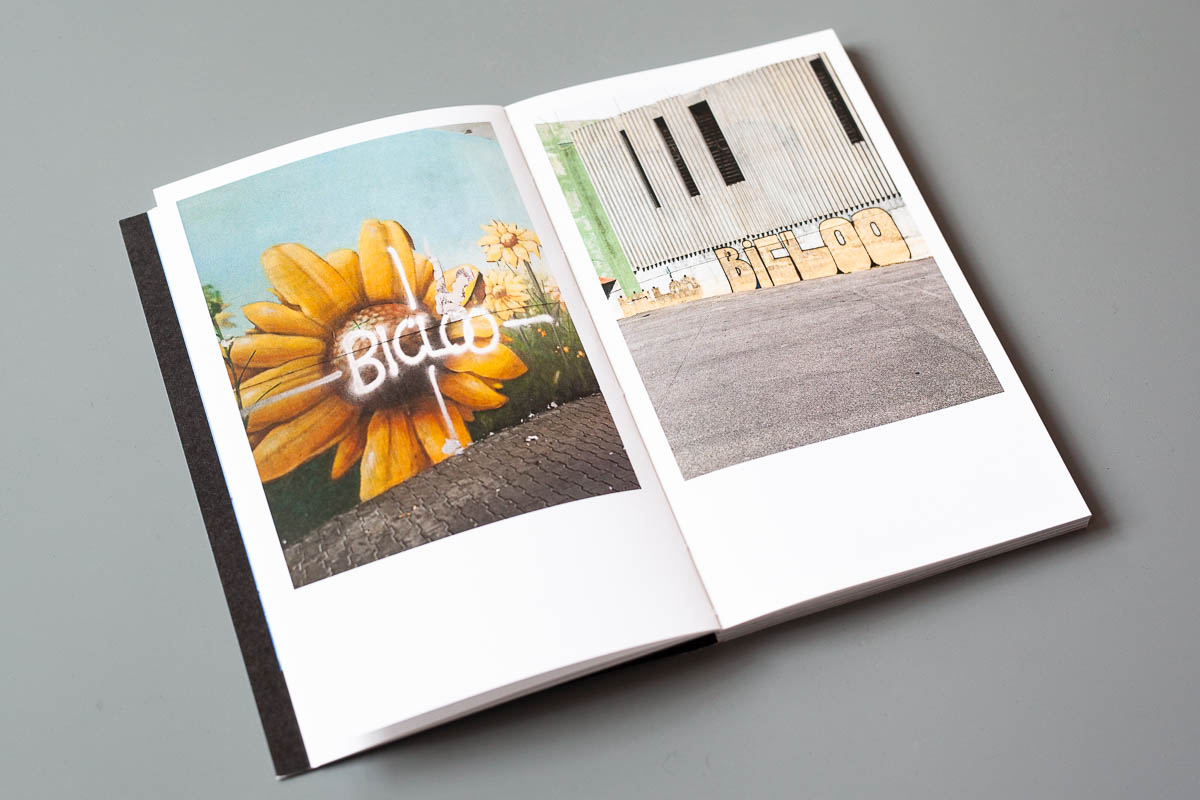
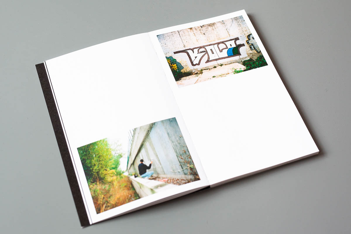
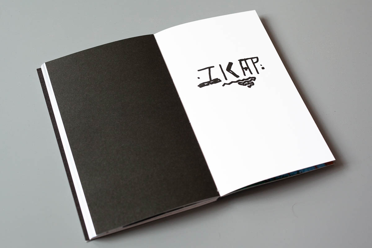
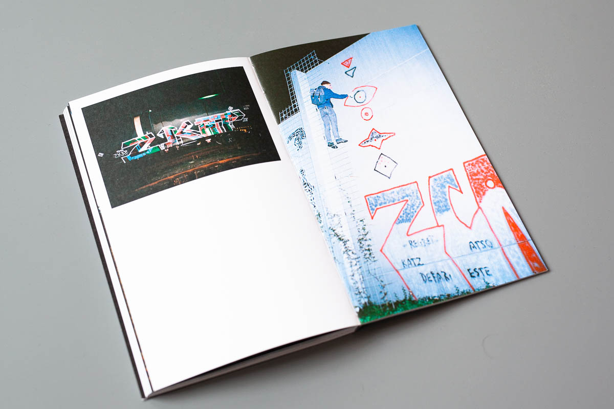
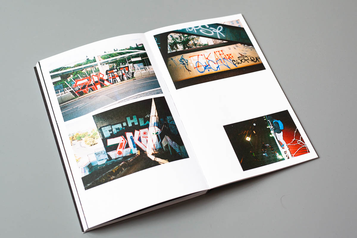
Almost one and a half year have passed since the last Prague based Guide zine was released. Whilst all three previous issues had a regional focus on the Czech capital, this time five European writers are featured in big chapters: BICLOO (Marseille), PIANO (Leipzig), ZKAP (Prague), TEFRA (Athens/Berlin) and KOLA (Kiev).
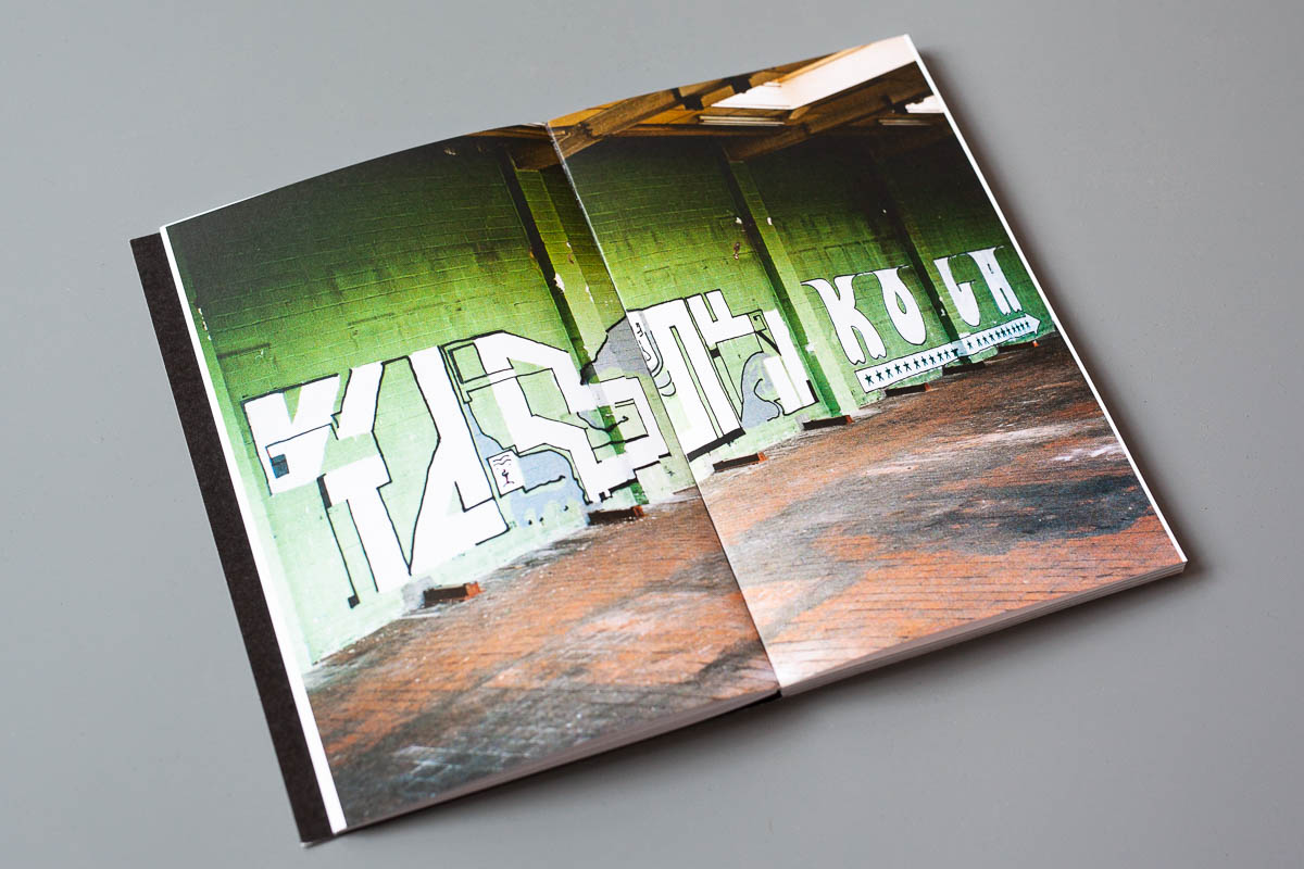
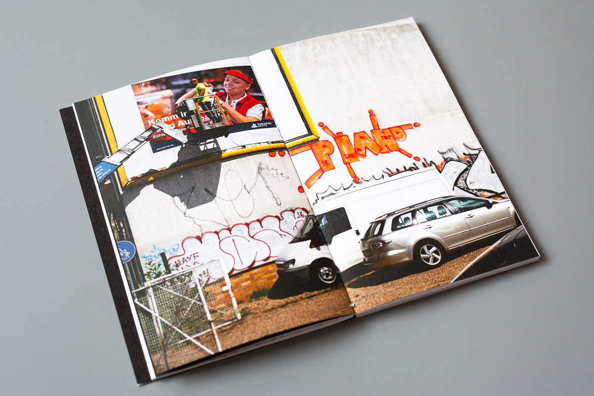
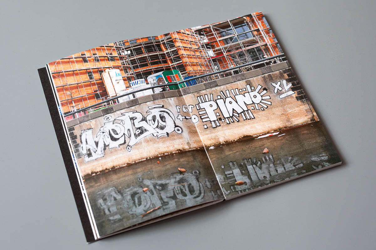
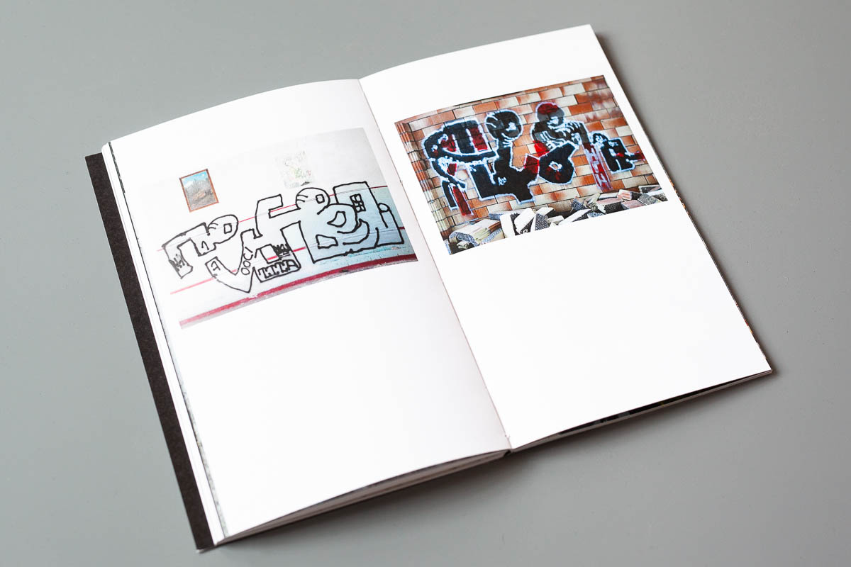
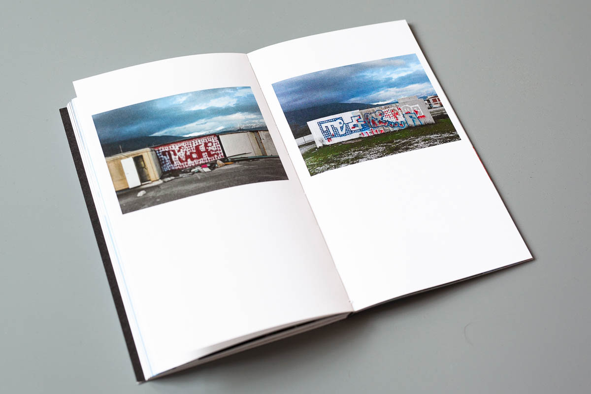
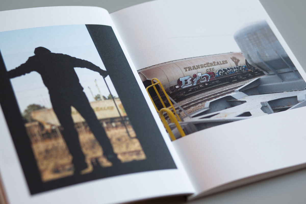
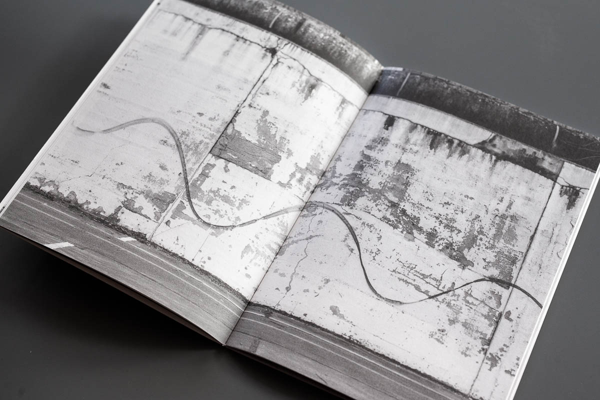
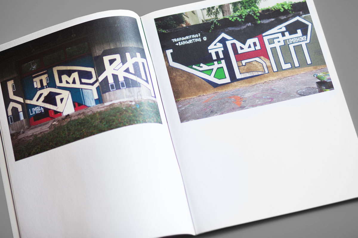
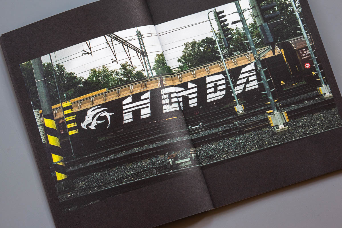
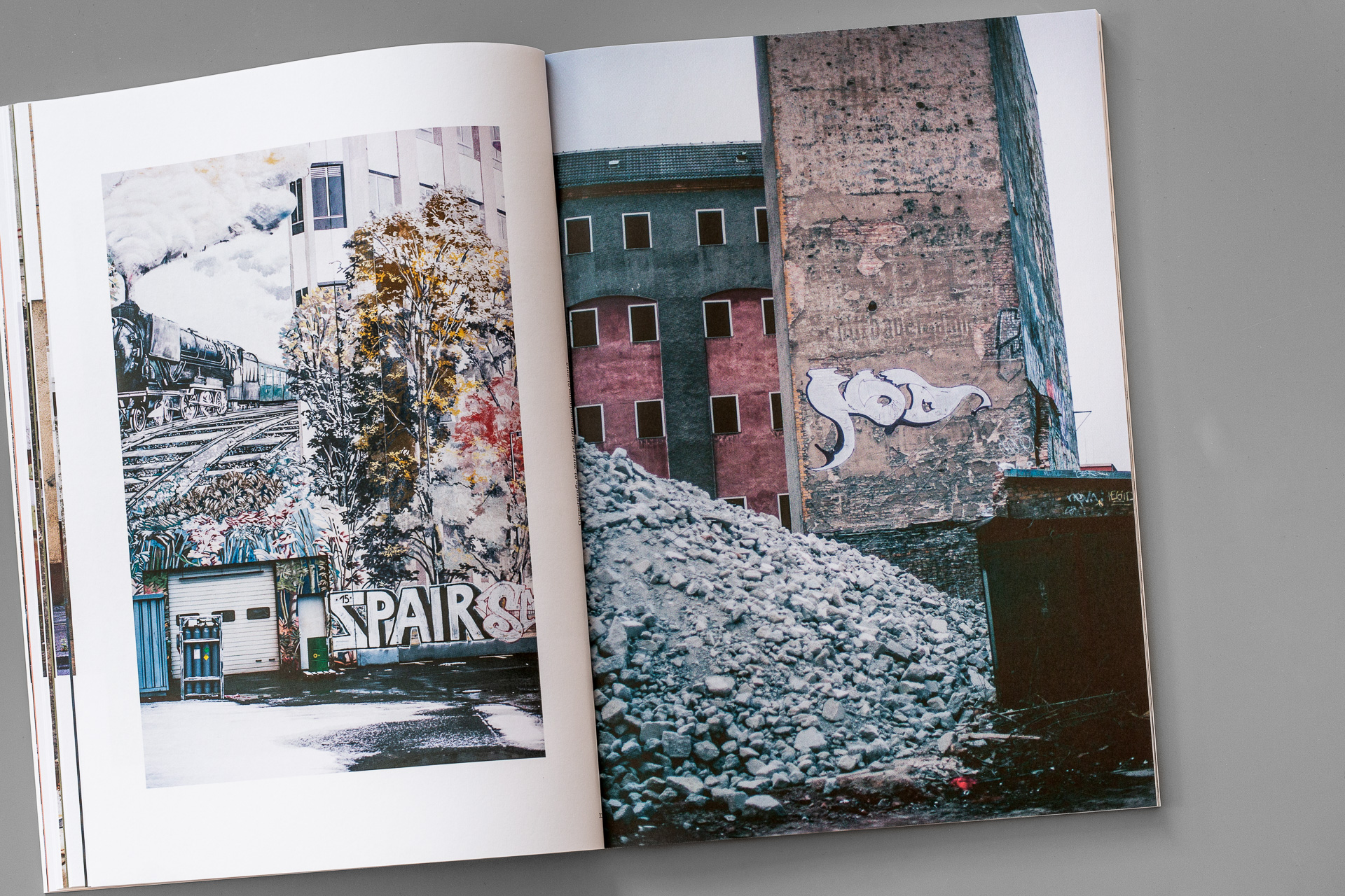
Each writer participated with photos showing artworks from the last three years in the streets, on trucks, in abandoned places, on trains, in backyards, under bridges, on freight trains, etc.. Skimming through the 120 pages comparing and analyzing the content, it comes to mind that the clear and readable letter forms, most often executed with two colours only, might have been the interconnecting element to fit these five artists together in one publication.
Although hundreds of kilometers in between, the introduced writers seem to follow a similar stylistic direction, whether it’s defined as naive-, anti- or ignorant style, the beholder could easily imagine a wall on which the quintet paint next to each other. The idea of combing different writers into a coherent concept issue works out quite well including interesting works far from traditional New York 1980s stylewriting influences. Even if a new tour is offered by the Prague Guide, we still feel entertained and can recommend attending the European edition.
120 pages, 205 x 125mm, 100 handnumbered copies
Print: paper munken polar 120g, full color digital print
Release date: January 2019
Publisher: Guide
Hitzerot interview with the editior of Guide zines
Every previous issue was clearly focused on the Prague scene. In 04 for the first time you did open the field and invited writers from all over Europe. Tell us a bit about your decision to change the concept.
This time I wanted to show someone from Prague in context of writers from other European cities. Maybe it’s obvious in times of internet and cheap travelling, but I was still surprised how people can create with similar attitudes, influence or react to each other, despite the distance of their place of living.
How exactly did you choose the featured writers this time?
I was searching for people whose graffiti is not spectacular at first sight, who work creatively with letters but at the same time they dont go too ´arty´ with the style. We can say they are classical in a way they spread their name in the city, they use simple letters, they do bombing.
Is there a particular style category to which the chosen specials belong to or how do they fit together in your opinion?
It seems to me as if those five writers tend to refuse some spectacular or cheap ways how to make a piece. In some cases they play a game with the viewer when they pretend to be less technically capable than they truly are. Although everyone of them is different, for me, they fit very nicely together because they cover a certain range of approaches- from throw ups by KOLA, through ´childish´ pieces by PIANO, simple letters by BICLOO and ZKAP, to organic shapes by TEFRA.
For example with ZKAP we once again see some new Prague stuff in the magazine. For someone who does not know the city and its styles: is this the typical Prague-Style at the moment?
At the beginning I didn’t want to feature ZKAP again becasue he was already in the second issue. But many people who I wanted to involve are not so active anymore or moved their energy into other fields than graffiti and I found it inadequate to put them in. But in general I think Prague is quite openminded and you can find various styles here.
Especially from the previous issue we know that you’re a lover of fine print products. Which are the special features this time?
This time I wanted to have a full color print and first time with Guide I made the sewn binding. I think 04 can look a bit like a magazine, but there will be other issues in the future where I want to print with riso again or combine more printing techniques.
Out of stock


