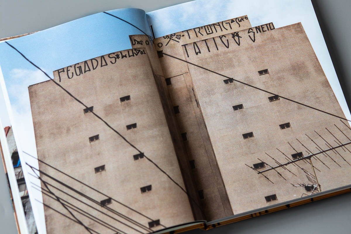
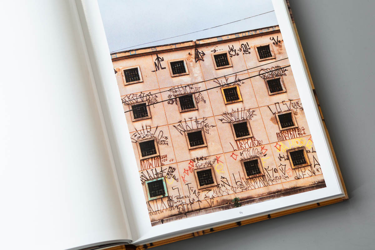
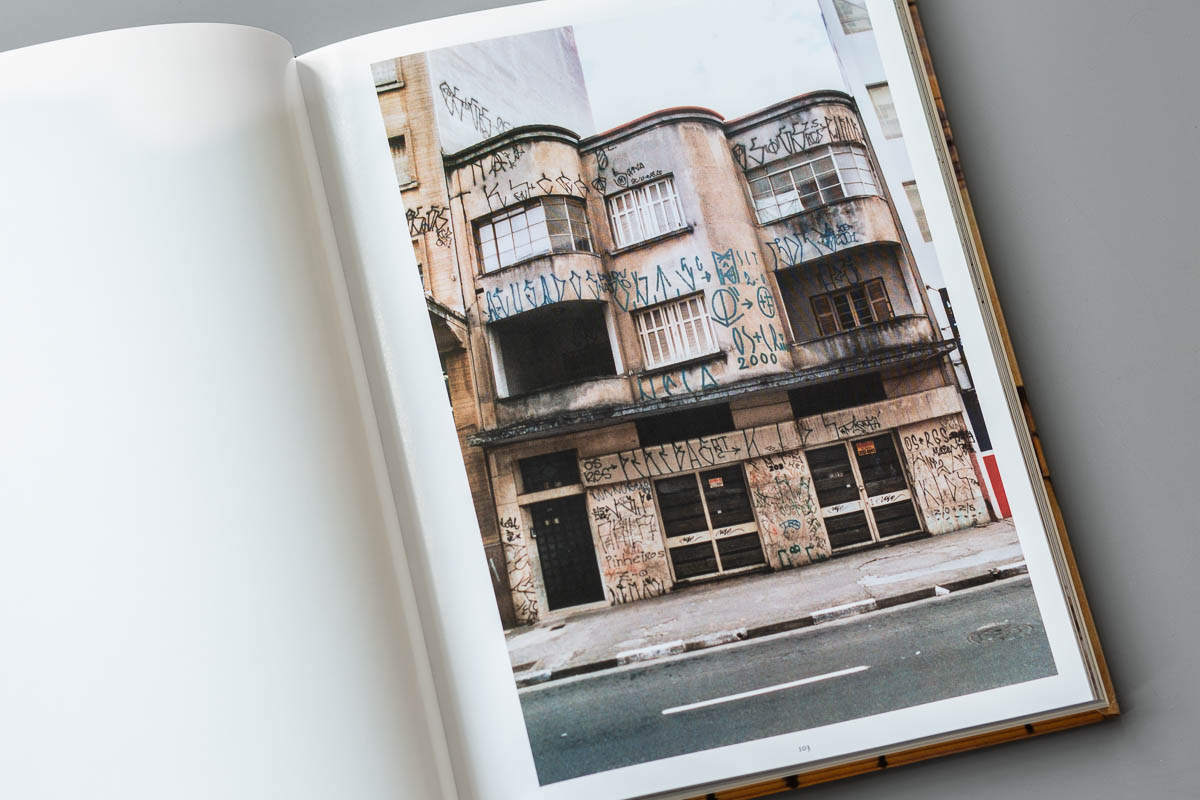
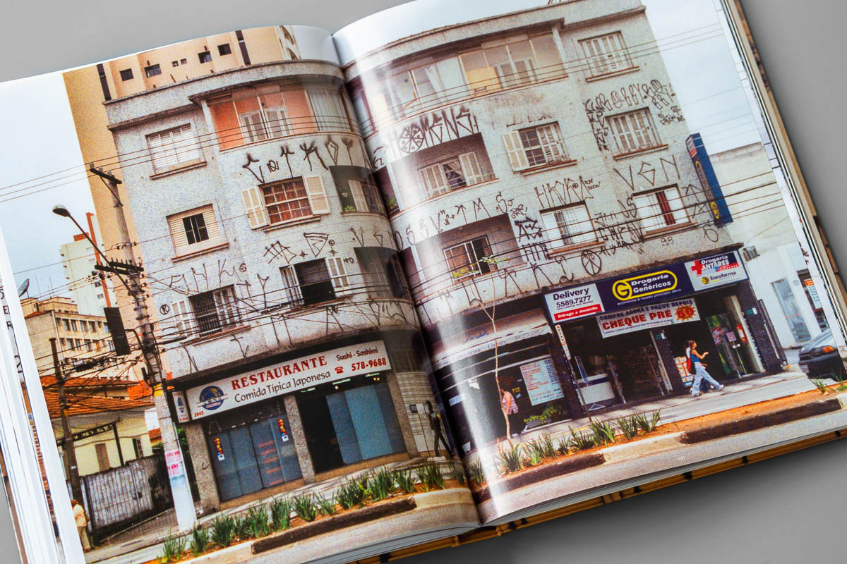
Pixação is a completely unique form of letter writing developed in São Paulo, Brazil in the 1980s. The black, extremely vertical, equally high letters were originally influenced by the runic typefaces of heavy metal band logos like AC/DC, Iron Maiden or Slayer.
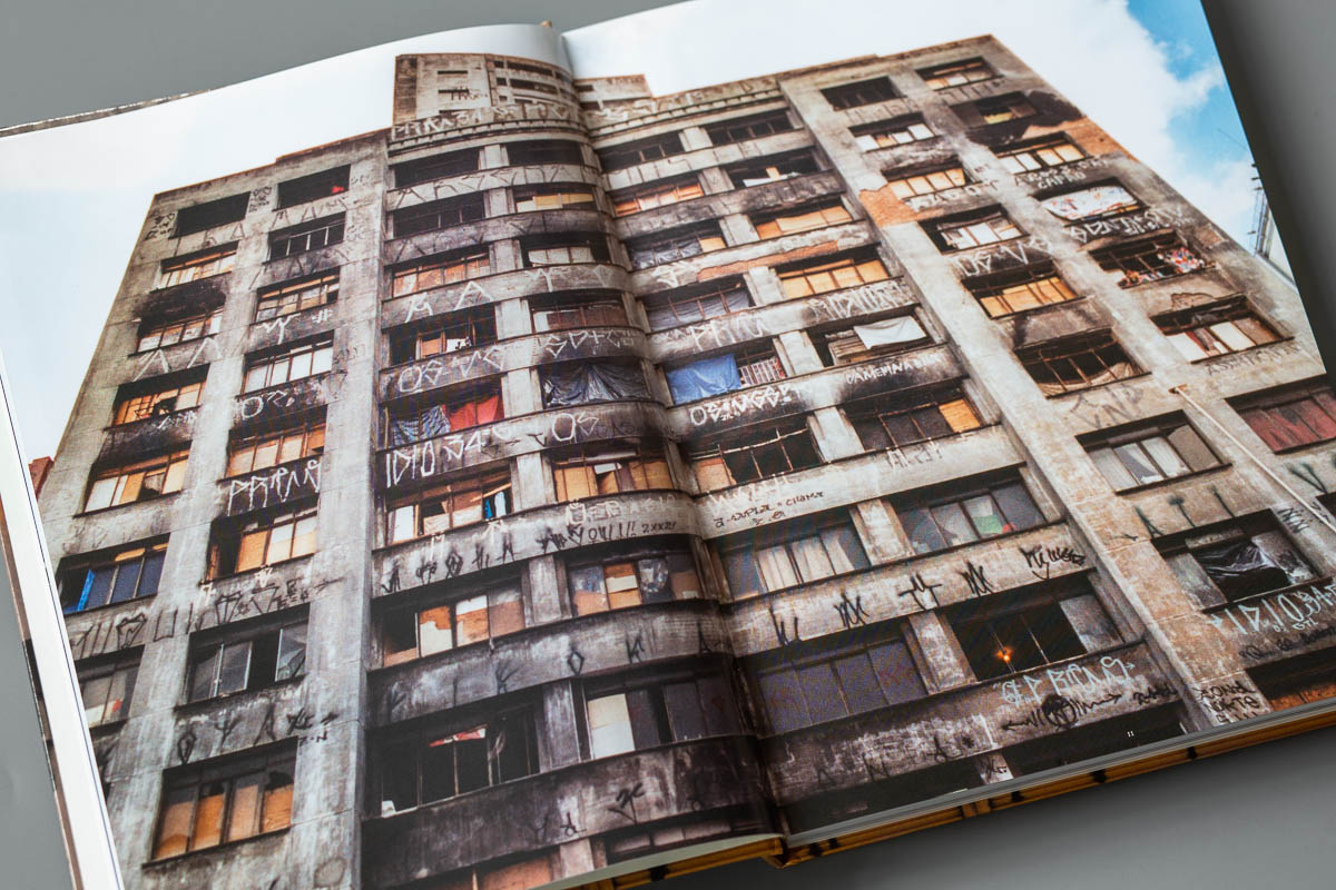
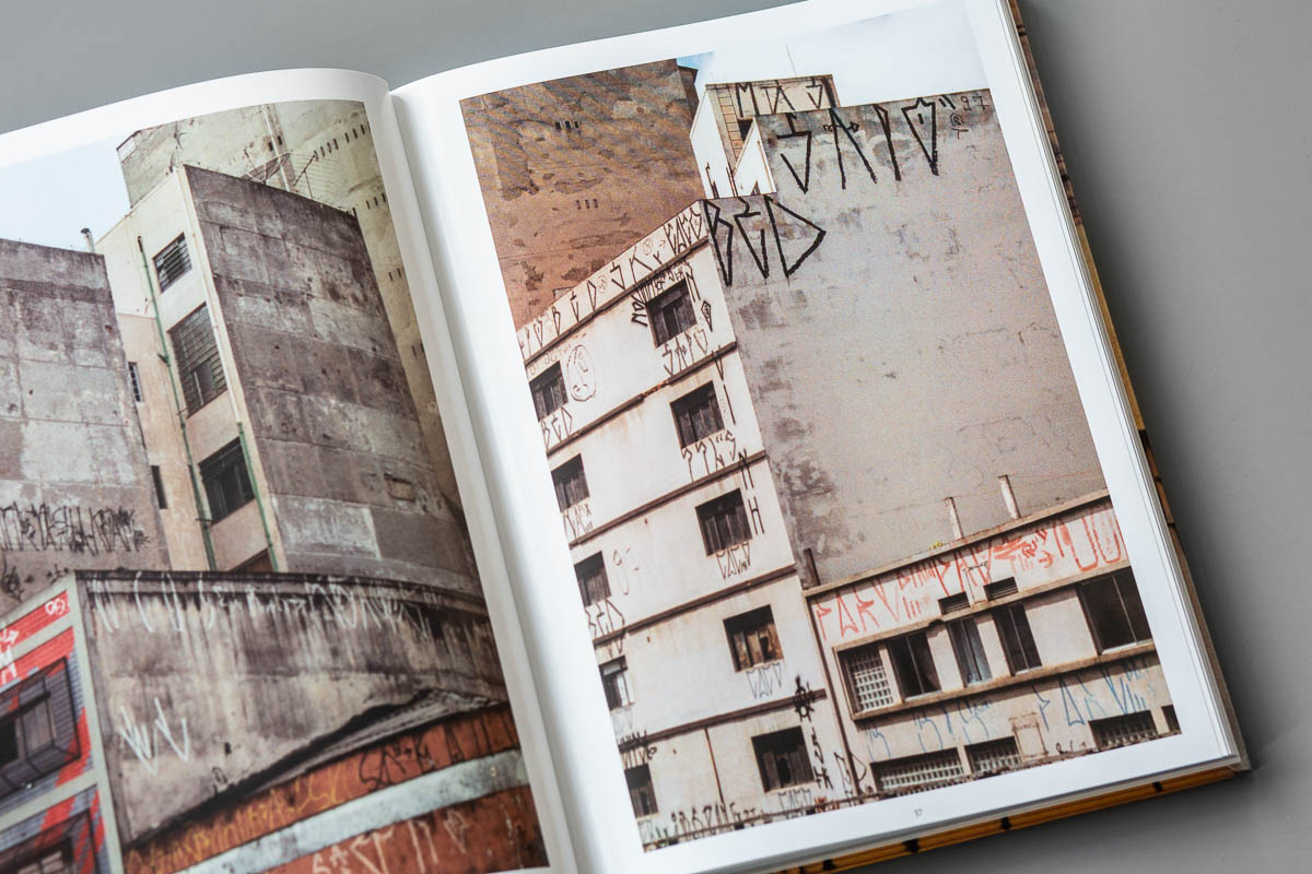
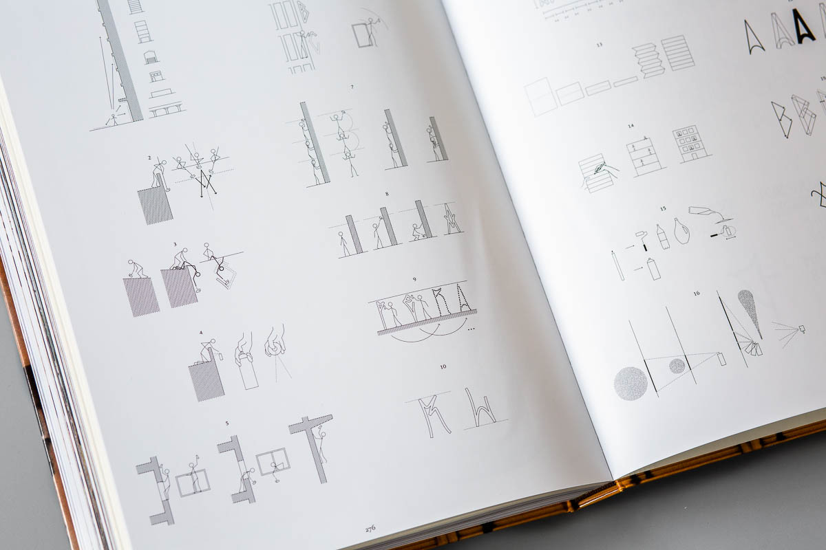
There are no outlines, blocks or other classic decorative elements. Pixações are not connected with the well-known American graffiti and have their own rules and techniques. There is no crossing, the different letterings are literally stacked on top of each other. The Pixadores work very well together and help each other to paint the best spots. They build human ladders to get higher, climb up skyscrapers on narrow edges or hang upside down from roofs to make their marks.
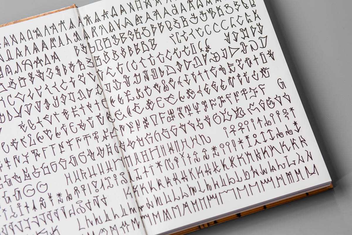
The 280-page book “Pixação: São Paulo Signature” by François Chastanet shows this pure letter writing on seemingly impossible spots with many amazing photos. This is followed by his detailed textual explanations of the Pixação history, its typographic analysis and the daring risks that the Pixadores take when painting. Everything is introduced with a foreword by New York Times journalist Steven Heller. In the last part, the previously described techniques and letter evolutions are graphically illustrated.
The 2007 published “Pixação: São Paulo Signature” by François Chastanet is THE standard work on these worldwide unique style. There is still no comparable book in such detail. Long sold out, here are the last remaining stocks of the English version.
280 pages, 20,2 cm x 26,8 cm, different types of paper, hardcover
Language: English
Release date: 2007
Publisher: XGpress


